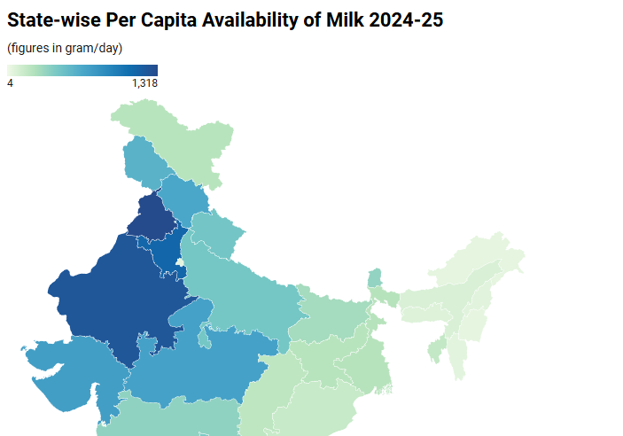
India’s national per-capita milk availability, now approaching 480–490 grams per person per day, often serves as a shorthand for dairy abundance. But when placed against a state-wise map of availability for 2024–25, a far more instructive picture emerges. India does not present a uniform dairy landscape; it reveals transparent gradients of surplus, adequacy and deficit, each shaped by history, geography, infrastructure and consumption behaviour.
This map is not merely illustrative. It explains where milk is produced, where it is consumed, and where access remains structurally constrained, despite national surplus.
How to Read the Map
Rather than ranking states, the map should be read in three broad bands:
- High-availability surplus zones – structurally dairy-rich regions
- Intermediate availability zones – adequate but pressure-prone systems
- Low-availability deficit zones – structurally constrained regions
 Each band reflects a distinct dairy reality and policy challenge.
- High-Availability Surplus Zones: The Dairy Core
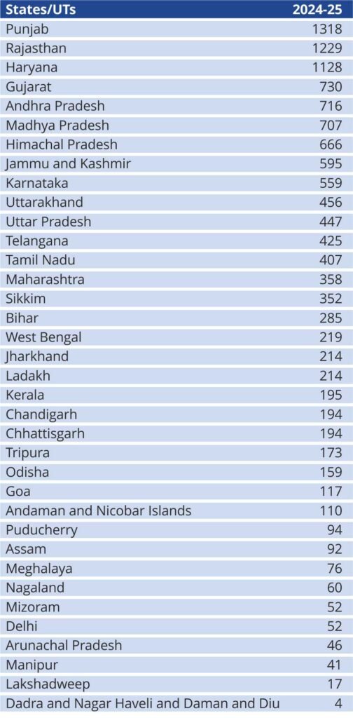
The darkest shades on the map are concentrated in north-western and central India, forming the country’s dairy heartland. States such as Punjab, Haryana, Rajasthan, Gujarat, Madhya Pradesh, Andhra Pradesh, and Himachal Pradesh report per capita availability ranging from 650 g/day to well over 1,300 g/day.
These regions combine:
- High bovine density
- Reliable fodder systems
- Deep procurement networks
- Cultural preference for fluid milk consumption
Here, milk is not just food; it is a primary livelihood and economic stabiliser. These states consistently generate surpluses that move formally and informally to deficit regions. Importantly, their challenge is no longer production growth but value realisation, sustainability and farmer margins.
- Intermediate Availability Zones: Adequate but Uneven
The mid-range colours on the map capture a diverse set of states, including Uttar Pradesh, Uttarakhand, Maharashtra, Tamil Nadu, Telangana, and Sikkim, with per capita availability broadly between 350–460 g/day.
These regions highlight a critical nuance: high production does not automatically translate into high per-capita access. Uttar Pradesh, for instance, produces more milk than any other state, yet population pressure moderates its per-capita figures. Maharashtra’s numbers are shaped by urban demand, where milk is channelled into value-added and institutional consumption rather than household use.
 In these zones, dairy systems are functional but stressed, balancing population growth, urbanisation, and evolving consumption patterns.
- Low-Availability Deficit Zones: Structural, Not Cultural
The lightest shades on the map are concentrated in eastern and north-eastern India, alongside parts of the south, which represent states such as Kerala, West Bengal, Odisha, Jharkhand, Bihar, Assam, and most of the North-East, where per-capita availability falls below 220 g/day, and in some cases below 100 g/day.
These are not regions that “choose” to consume less milk. They are regions where:
- Bovine populations are limited
- Fodder availability is constrained
- Procurement and chilling infrastructure are weak
- Dependence on inter-state inflows raises prices
Here, dairy is nutritionally essential but structurally inaccessible. This is where national averages fail most starkly.
Union Territories: Special Cases on the Map
Union Territories appear as extreme outliers. Delhi and Chandigarh reflect urban dependence on imported milk and processed formats. Island territories such as Lakshadweep and the Andaman & Nicobar Islands show the impact of logistics rather than demand. Very low figures in some UTs are statistical artefacts of scale, not indicators of nutritional absence.
These should be read as logistical case studies, not policy failures.
What the Map Tells Us and What It Doesn’t
This map makes one point unambiguously clear: India’s dairy challenge is no longer national production. It is regional access and distribution.
- Surplus states must focus on efficiency, sustainability and value addition
- Middle-tier states need a processing-consumption balance
- Deficit states require targeted dairy development, not generic schemes
A single national narrative obscures these differences. The map forces us to confront them.
Conclusion: From Averages to Access
As India debates nutrition security, protein adequacy and dairy exports, this state-wise map should anchor the conversation. Milk abundance at the national level masks deep spatial inequities that determine who benefits from India’s dairy success and who remains on its margins.
The next phase of India’s dairy journey will be defined not by how much milk is produced, but by how intelligently it is moved across regions, income groups and diets.
In that sense, the milk availability map is not just descriptive. It is diagnostic and a reminder that the real work now lies in bridging the gradients.
by Prashant Tripathi, Dairy Dimension